
Blurb Whitewall SAAL photo book review, a detailed photo book review by a professional photographer.
Why print a photo book?
With all the options of photo books offered on the internet it can be quite hard to choose the right one! This Blurb Whitewall SAAL photo book review is here to help you decide if these are good choices.
In this digital age few images are printed. That goes for photo prints and magazines. Decades ago all we all have fond memories of our photo albums of family and friends, trips to far away places. Those memories quickly bring back in sharp detail more than what is in the picture. These are of course close to the heart. Swamped by imagery everywhere, one cannot put much more than a fleeting like on someone else’s image or video as they cannot be as personal.
Where will the history of photography be, or your personal stories if in print once and a while?
What better way to have a permanent record as no one knows what will happen over time with digital files.
Where to search and how.
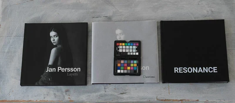
My search for a good photo book review and printer started some years ago to print a wedding album, which is what led me to write this photo book review.
At that time I visited all of the stands at Salon de Photo a huge yearly photography show in Paris. I picked up samples from Blurb, Matisseo, and Whitewall, some others including offset printers that were present.
After a Google search and watching some Youtube videos, I chose Matisseo. https://www.matisseo.com
Between Blurb Whitewall SAAL they did not offer true photo lab prints. All was well except for the fact I did not choose the right book, which was not clear. I ended up with a perfectly designed and printed book that was just laser print on demand.
What I liked about Matisseo was their very good page layout application, and delivery in a superbly packaged foam padded case. The printing quality was as expected, good not great yet in line with the best in laser printing.
Once, on a bus with only Magnum photographers going from Barcelona to Arles, they were talking about their recent books. One turned to me and asked “which books have you printed”?
The answer was none which surprised them.
With all the art series I have photographed while having made prints for galleries, a book was never made.
Recently, a very good photographer friend asked me to help select and edit a book of his images.
Thus began my search for Blurb Whitewall SAAL type of printers. I read what reviews I could, what Youtube videos were out there and carefully looked at most possibilities out there.
Ultimately it was as much for the book I should have done years ago, as for his books.
Narrowed down to 3 printers
Blurb Whitewall SAAL phot books offered what was needed.
Requirements were:
- Hard cover printable or sleeved
- Premium page media options
- Possibility of reprints
- Decent shipping in Europe
- Page Layout by InDesign or PDF
Three printers
Photo Book Review
Click on the images. Each printer offers unique options. Some are easy to understand others not at all. Best check them out for yourself.
What is great, good, and bad about these 3; Blurb Whitewall SAAL
Blurb.
Blurb have an incredible support team. They answered any questions I had very quickly. Almost every question you could ask is likely already answered in the multitude of FAQ and help pages. From beginner to expert there is so much information if you want to look!
Blurb have around the world delivery so that is a big plus.
Their InDesign templates are perfect. All information is there no doubts or bad surprises are in the page layout. They also have a truly fantastic online layout application, clear and concise. There are so many reasons why for this photo book review Blurb came out on top.
You need to design the cover sleeve if that is your choice after the number of pages is finalized. The cover can be uploaded at the same time as one PDF or separate PDFs. There is one area to watch out for: The upload from the Blurb export plug-in remembers the last file folder location used. Thus if you revised the cover or pages document MAKE DOUBLE SURE you have chosen the right new location or files.
Blurb have multiple ways of uploading. IF you import (download) the job options, you can export a corrected PDF from ID, then upload that with their PDF uploader (hard to find on their site).
OR you can export directly from ID with their export module where you’ll log in to your Blurb account. Very cool both work perfectly.
Just be aware if you select to keep the Blurb logo at the end of the book ( a good way to reduce the book cost) it will not be shown in the book preview). Nor will the ISBN code bar be shown, even while selected in the export dialogue box.
With Blurb your potential for lay out and typography are unlimited. The others definitely are.
Pricing at Blurb is better than the others, and if you are going to sell on their site or on Amazon with their free ISBN number you will really appreciate what Blurb does for you.
Highly recommended for serious book makers needing more than just a one off copy.
What could be better with Blurb:
Free shipping from the editor’s country to the EU client. For example, I uploaded the book to my French account, but would have liked to do free shipping to Sweden.
A heavier page stock.
Black or white inner page leafs.
A more neutral (slightly warmer offset grey reproduction) for black and white pictures. Here Blurb has good control over spread to spread colour and density but it still looks like laser as it is too blue compared to the reddish colour of grey in offset.
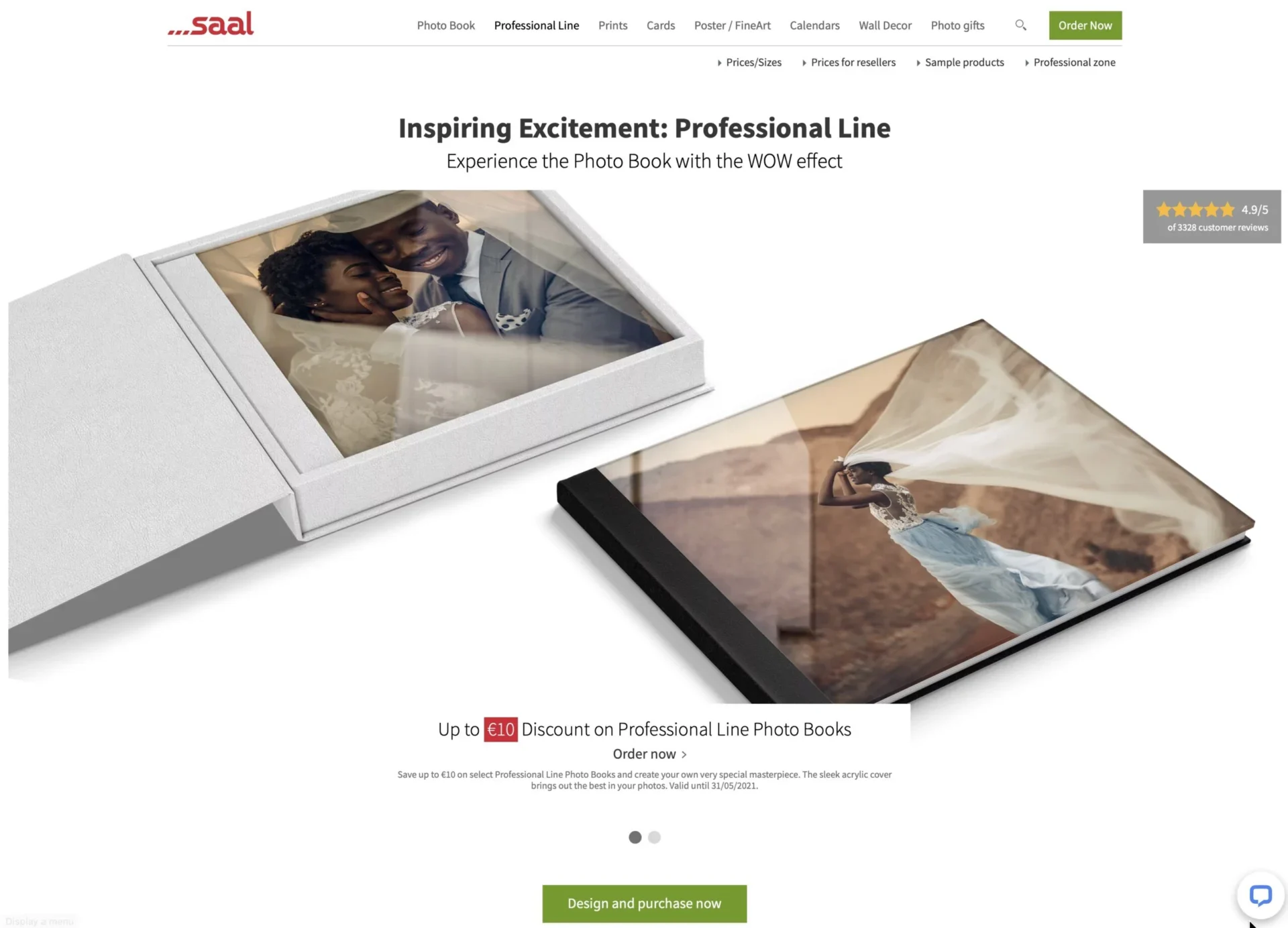
SAAL
SAAL often give vouchers in trade of a review maximum 100€. SAAL is surprisingly the most expensive!
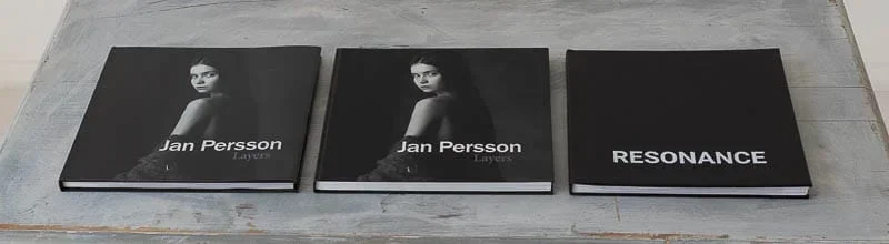
That was enticing as we had already printed with Blurb (multiple times) and Whitewall.
After accepting their deal, I wasn’t sure to be able to redesign the same book as for Blurb and Whitewall, so I went ahead and finally made my own book!
Out of the three SAAL is the most confusing of sites. Blurb is ideal and by far the best, likely the best there is.
On SAAL’s pages they push you towards an automated page layout. They have call to action buttons everywhere yet not so fast, I want to know what it is I’m trying to find!
Only after digging around will you find the “Professional Zone”. The page size information is all over the place, good luck on figuring out if you are in the right place or not.
You’ll have to download the ID or PSD that corresponds to the page number, not where oit is marked spreads and for the right type of book! After doing so your downloaded ID files will have a stupid name like; a1e0a510e4c95724b7e98cea….cd0fe507668d3b93068a06c4692b9d878eb68cb53e1ee.idml
Oh yes SAAL you have some work to do!
You’ll need to go through a lot of information mostly redundant, and sometimes confusing as there are mistakes in their documentation. IT is best to download their job options for InDesign. Then be sure to set your InDesign settings to what they say, regardless if your text will become rgb! They really do not have designers in mind.
They do have an automated, as well as web based application to do your page layout. It works fairly well, yet very amateur typography choices and clip art that no one should ever use.
Surprises are everywhere with SAAL. Like if you want to go through their site in say English, set up an account, you won’t be able to use that, you’ll have to use your countries site which is independent of all others. You cannot therefore log in with your password as their site will say it is already used. Hmmm SAAL what are you thinking?
They say you can design you cover text. Then you have no options, only a few typeface options, and limited placements. Basically, you have only the option of a Basic dreadful cover text. No spline text is available. No sleeve is available. The only options they have the others don’t is an acrylic printed cover! Not really a true photo book in my opinion.
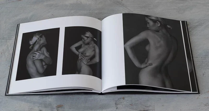
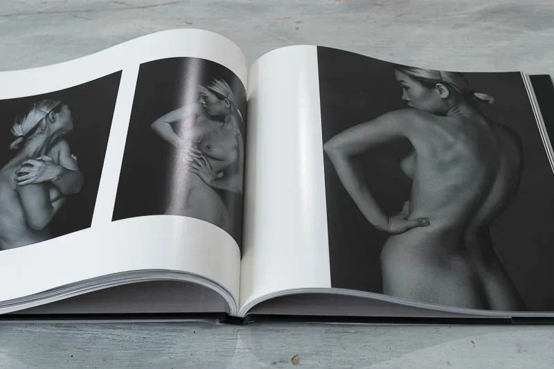
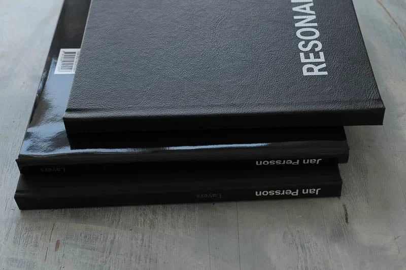
Quality: Poor. The pages have large differences in colour between spreads. Page quality is not great. Cover is really bad. Binding is not great. Corners are really bad. What can I say but really poor quality.
They have ICC profiles on their site. I soft proofed the book, and noticed the pages would be on the bluish side. For the first time I say the pages were in reality worse than soft proofing. For the photo book review, there were glaring errors crying out.
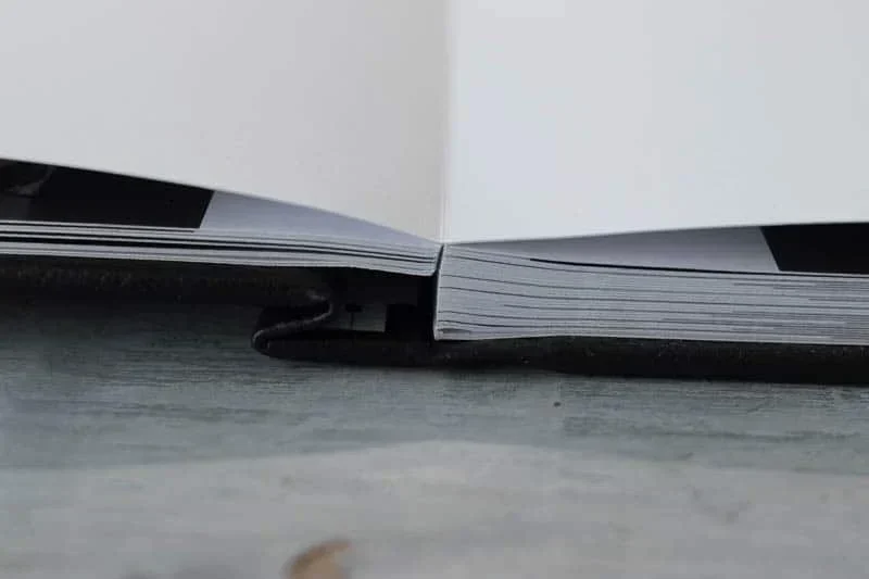
My book the cover warped both sides, and the inside page glue separated. Inacceptable.
I asked for a refund. Refused. They went on to suggest a reprinting. Well I don’t need another poor example of what they do. Still refused refunding the difference.
Correspondence with them was snarky and often delays were a few days.
SAAL is not for serious professionals or designers. Wedding photographers may find laser quality books acceptable for their clients who wouldn’t notice as they are not experienced in printing but for all others avoid SAAL for photobooks.
For amateurs their online page layout is quite good, yet they need to think of professionals
Since they are the highest price for the poorest quality I cannot recommend SAAL.
What SAAL could do better
Just about everything.
Whitewall
White has become on of the biggest in Europe for all kinds of phot printing. Perhaps the book making is rather recent compared to their excellent print service. I say that as there are holes in their information on designing and printing your photo books.
Their tech support is oaky, with a longer delay than Blurb. The answers were not precise, and the tone was a little off. IT was like they were saying why would you ask that?
Funny as the question was “why is the InDesign template single page only”?
How is one to take Whitewall as being serious for book makers when their template only has single pages?
Designers and graphists cannot find single pages do be user friendly as you cannot really have bleed pages.
Returned question was can I not then duplicate the bleed image and place it over the single page? They answered you could but it is not advised, by a so called expert.
Anyway, the book printed correctly and all of my spreads and bleeds worked as expected.
I can tell you it is a little scary though sending up a book while not knowing if their poor instructions on the first printable page and bleeds that could be reversed is going to cost you 150€!
To get to the uploader is also very strange. You have to go through the process of ordering your book again taking you back to a page where you thought would have been the uploader. I went through this loop more than once! When you download the page template it is titled in German and doesn’t really tell you much if the size is correct. Be very careful as it is imperative that you have the right template and cover template for that number of pages, size, media type.
In the end what counts most is print quality.
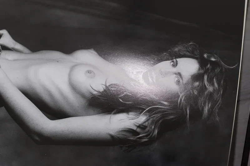
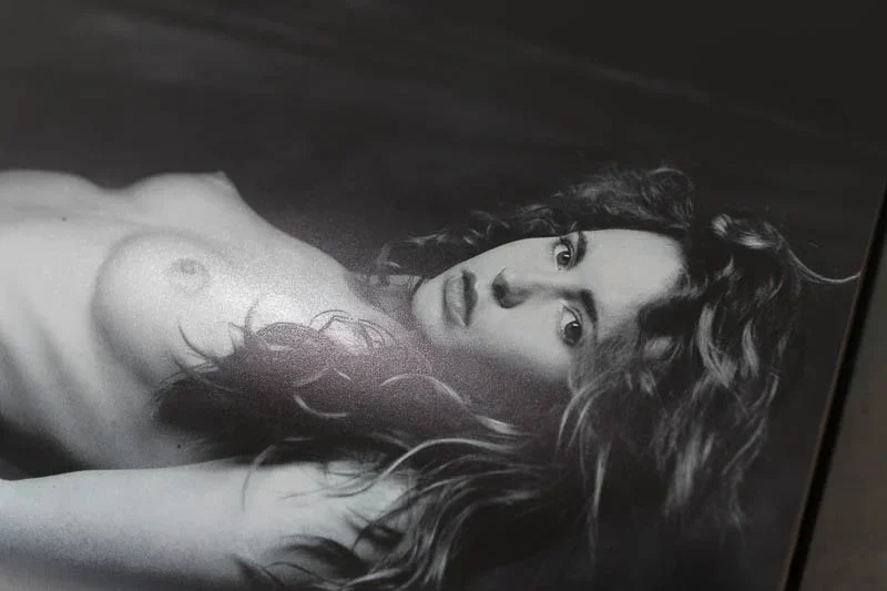
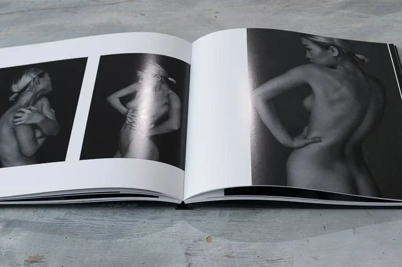
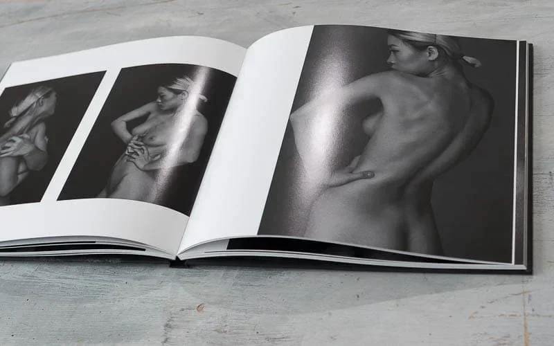
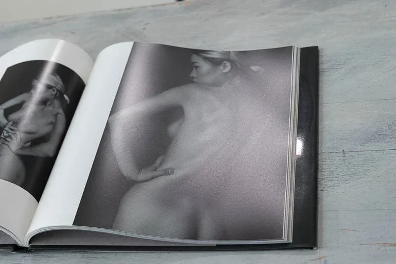
There our Whitewall book is really above par. For once the greys are printed towards an offset grey with slightly more Magenta and Yellow being a warmer tone. Consistency between spreads is on the same level as Blurb, and in my experience with offset, within line of good control techniques. Lasers have more variability than a well-controlled offset in that the spreads have no human intervention as they are print on demand books. Whitewall say they are inkjet printers rather than lasers which may explain the better rendering!
The cover of Whitewall book is superb, different of course than the inside page yet a creamy smooth rendering that looks so close to offset or even an inkjet print. We chose the matte finish and has a soft touch feel, resists fingerprints.
Excellent media choices, although they updated the names but not in all places on their site. That makes it difficult to know what you’ll get!
Four choices Standard Silk Matte 170g/m2 Premium with Glossy Finish 250g/m2 Premium Silk Matte 250g/m2 and Premium Matte Uncoated 170g/m2. We chose Silk matte.
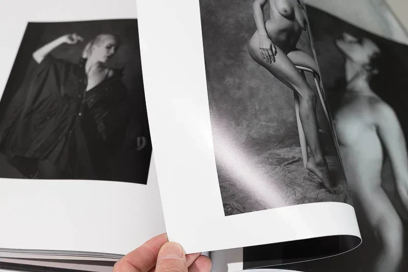
The pages are thick, have great contrast deep blacks and show good separation in dark tones. The spreads are a little resilient as the paper is thick and has memory, unlike Blurb.
Highly recommended Premium Silk Matte.
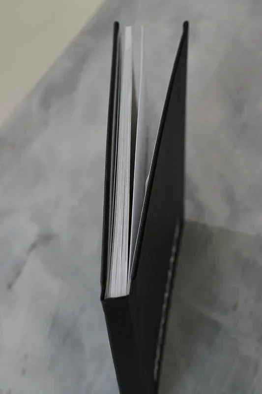
The binding is perfect nothing to say there. The book is put together well, I think it will hold up over time.
What is super nice is your choice of white or black book end paper. We chose black, and it is a superb finishing paper that goes with the interior covers as a match. That is rather shocking with Blurb as they have a sort of grey paper then goes to your choice of white or black!
For soft proofing Whitewall has extensive ICC profiles as do SAAL. With that you can safely soft proof if your colour management skills are up to the task.
Highly recommended for a close to photographic rendering! More costly than Blurb, yet the difference is obvious from the cover to the last page. Colours density, smoothness, and feel in the hands makes it worthwhile.
What Whitewall could do better
Double page spreads, a must for designers.
Clean up document naming like media types when they change.
A standardised file template naming rather in English.
A book sales and reprint option as Blurb do.
Shipping options to all countries in the EU!
What you can feel and see makes the difference!
Blurb
Media type Mohawk proPhoto Pearl 190g/m2 said to be luxury finish, pearl satin.
They also have an eggshell superfine that would be worth trying.
What I love about this paper: the slight satin pearl finish is beautiful without having glare from spot light sources. It does reflect more window light in a broad way that Whitewall does not.
Curious but, Blurb’s Mohawk paper does not exhibit gloss differential (sometimes called bronzing) at all. This is commonly found in inkjet prints where zones of light or no ink are mat and inked areas depending on colour reflect light in a reversal appearance. Whitewall shows this, perhaps because it is inkjet?
Blurb printing has a reliable and consistent screen with perfectly patterned rosettes. Under a loupe or microscope it shows its strengths.
Page thickness is lesser with Blurb than SAAL or Whitewall. Not a bad thing as the book opens flatter and doesn’t try to close itself as soon as you let go of a page.
Robustness is definitely a feature of Mohawk paper. You can bend the pages and “moons” are not easily created. Page flex memory is really good, the pages curled release easily. All this to say with finger print resistant pages, abrasion resistance way up there, corner marks, all the details are preserved over time and after many views.
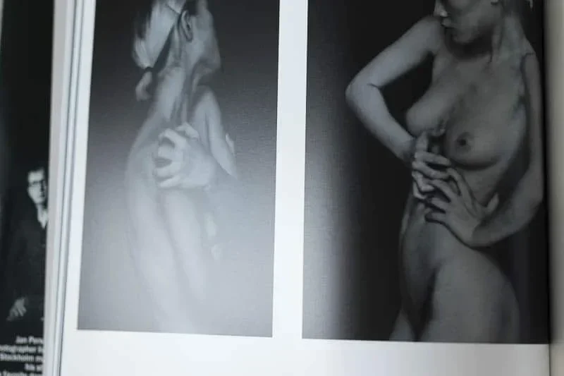
Much of the details for our photo book review can be described you’ll only be able to experience feel by having a book in front of you. Blurb I believe offer a media sample pack for a small price if in doubt.
WhiteWall
What makes this photo book review hard is saying which is better between Blurb or Whitewall.
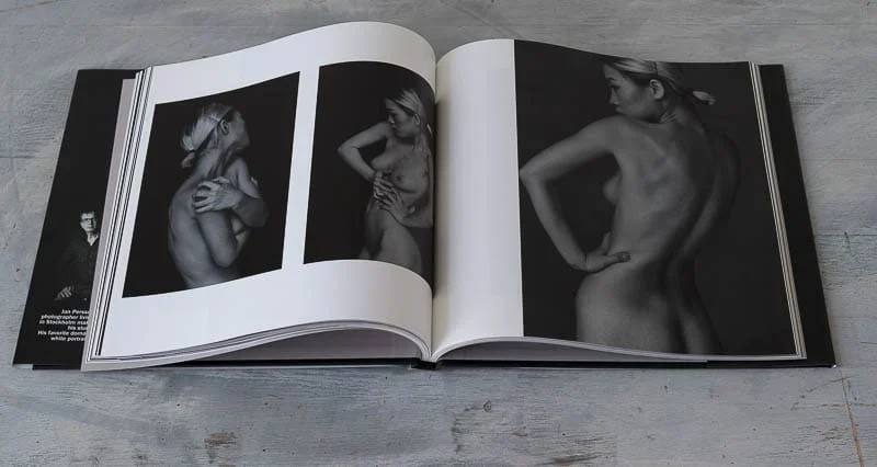
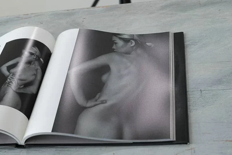
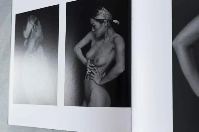
For our photo book review we chose a similar media to Blurb, Premium Satin Mat. This is a very thick solid paper at 250g/m2. Being so thick and heavy, it has memory and curl could be a problem. Also, the media is less resistant to fold/corners/”moons” if bent abruptly. It is however very scratch resistant, and resists finger prints even mores than Mohawk.
The finishing is sublime, yet has a strange effect of non inked areas are rather mat. It is not a bad or good result just one that is unique. Almost like pages with lots of ink have a sport varnish!
The brilliance is very good, white point excellent. Overall Premium Satin Mat raises the level for our photo book review to the highest level.
Whitewall is unique in that they print on inkjet printers. So there are no printing cells made by the screening of a laser, yet very fine transitions by variable droplet placement. This results in excellent rendering in all areas, and provides for extended contrast and maximum densities.
A certain strange side effect is however some gloss differential. It is there, but it is not a glaring problem, only when you are looking for it at certain angles.
Being that this is the thickest media in this photo book review, the pages do not hold flat other than the middle of the book. For that reason the pages are beautiful to hold, each one like a print, yet when you let go of the corner, it is going to spring closed. IF you want a more book like experience Blurb will be you better choice.
SAAL
A photo book review has to be honest.
I was tempted by the offer of 100€ voucher for participation in spreading the word aboutSAAL’s photo books.
I wanted to print a third edition of the same book, yet making the layout was very hard to do because their lack of information, integration, and support responses. I put together a book of my own images.
That makes side by side comparisons impossible, yet the overall look and feel is easy to compare as I have all the originals for all books, and all production was done on a top quality editing system with perfectly calibrated BenQ SW line monitors.
SAAL’s media choices are poor. Glossy photo paper, certainly not a choice that book designers would make, Matte Photo paper which I had to for this photo book review, or High End Print Matte which is uncoated thus unstable for photographic books.
The only redeeming thing is about our SAAL book is the pages lay flat.
They have poor light end roll off with not so well done rosettes in the screening process. Light areas are missing fine dots, thus highlights can run with variations in tint, causing coloured contours. There are errors in printing, likely due to press quality controls.
The mat media is marked as semi gloss. It is not. It is mat poster board paper with a huge amount of optical brightener. It looks and feels like a cheap laser print for presentation.
The texture is again not great, it has no feeling or character of quality printing.
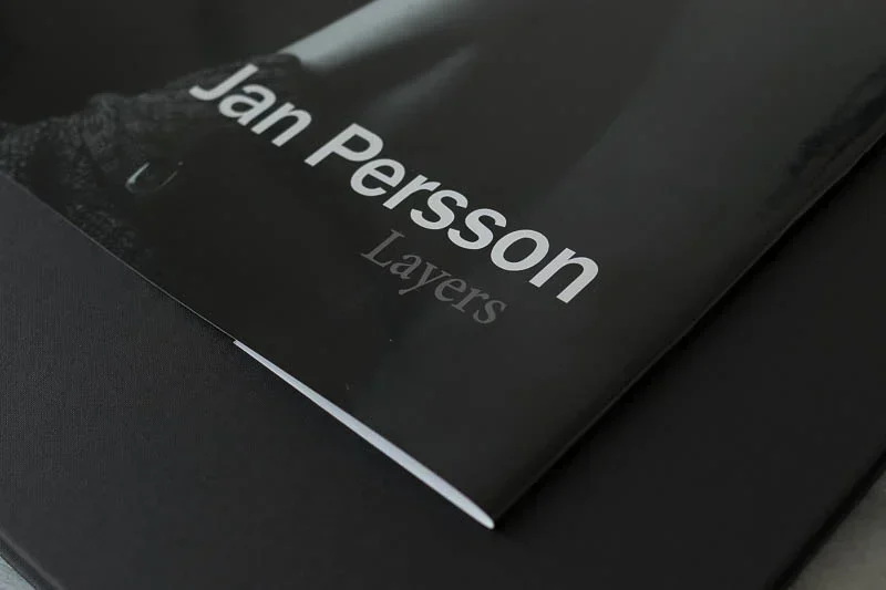
Covers jackets and other open and close details
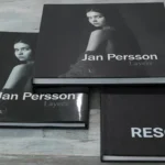
Blurb
Blurb has many options on covers and jackets.
We chose the printed gloss jacket with a black linen cover.
Jacket printing is a different set up than interior pages. With Blurb’s InDesign template this was as easy as the rest, no surprises, a real delight to do. Splien text was as it should be, exactly right, as long as you follow their excellent indications.
There was a question on ISBN placement on the back cover and the Blurb logo on the last page. They quickly answered, and as I guessed not shown on the preview but would be added when printed.
The jacket is heavy weight high gloss media with a foil I believe. You couldn’t differentiate this from an offset jacket.
Everything about Blurb is making you feel like you are in control, and publishing a real book, not just a one off photographer portfolio.
The binding and cover linen are beautifully done.
The only option we would have liked to see was a jacket and printed cover.
The inside pages are choice of black or white for the last page Blurb logo bringing down the price a lot if chosen. Unfortunately the other pages between cover and printed pages other than the Blurb logo are light grey.
We would have preferred the; choice black or white.
WhiteWall
Where Whitewall shines is the precious feeling of the covers they offer. We chose the SoftTouch mat for this photo book review.
WhiteWall has ICC profiles for the covers so you have a good idea of the potential if colour managing your workflow.
All I can say is the cover is as good as the best custom offset books I have seen. The feel is luxurious, and robust. Binding quality is excellent.
Inside pages are for you to decide white or black. The paper is also luxury paper similar to light print matting frame paper.
You cannot mistake the quality feel here.
Printing on the spline is easy to do, although instructions are not as explicit as Blurb.
Typography quality was great different than Blurb’s screening all options and layout exceeding expectations.
SAAL
Full of surprises. SAAL fails here for our needs.
To be clear, SAAL could be a great choice for wedding photographers. Their application is made for that type of workflow.
Their cover choices are too, completely thought out for wedding photographers.
Yet we are comparing photography as in fine art for our photo book review.
SAAL’s cover push for an acrylic cover. There you can print on the spline.
Yet, if you choose the leather or linen options you cannot. Would be better if that was said up front!
There are few options for typography on the cover, there too a huge disappointment.
The quality is okay not more.
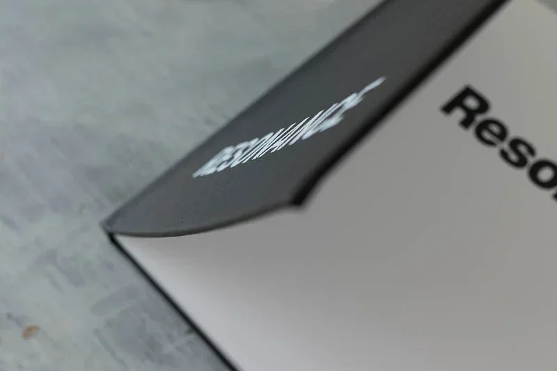
The bigger problem is the gross error in binding! Our cover inner page separated. The glue was not done correctly, the alignment and cutting poorly done.
SAAL offer a lot of simili covers even cork. Again perhaps interesting for wedding albums but not for serious book makers.
There are no options of inner pages or jackets. The pages start on the same page media and are glued directly to the cover.
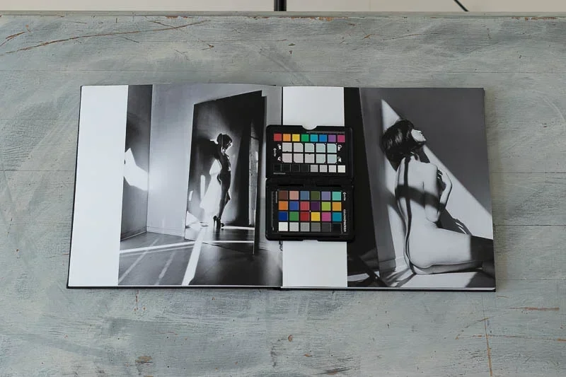
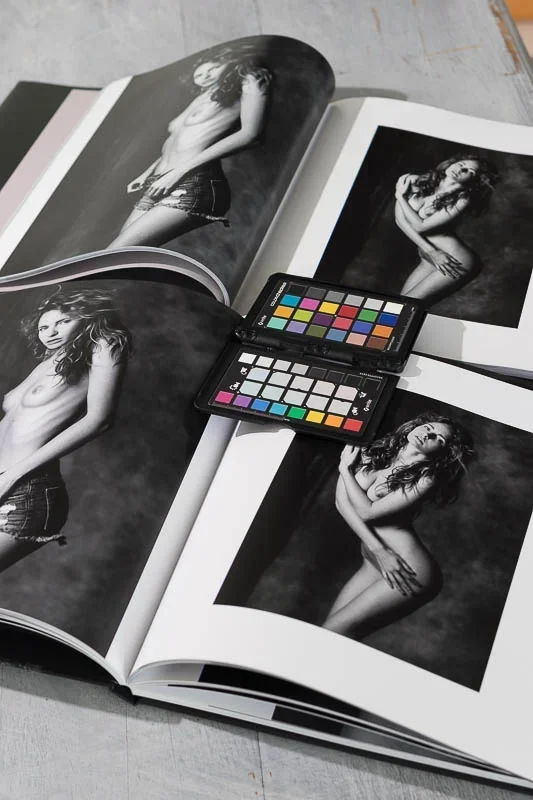
Colour and print quality pages
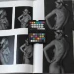
Blurb
The overall print quality is very good for a laser output.
That is evident that they control their presses to the highest degree.
That said this is laser technology, not offset. Between spreads the consistencies is good yet not spectacular. Whereas offset speeds are controlled by inking after careful prepress plate making is done. A modern offset press can achieve near perfect results with a talented operator with control checks.
That type of control is not possible with laser static transfers. And it shows.
Blurb has mostly a slight green or cyan or cast in some over prints. Although some Indigo presses can print multiple black inks with Blurb that is not possible considering the demand for on off copy print on demand workflow.
Page to page consistency and front to back will have variance.
That variation is also dependant on image density as GCR ( prepress term for controlling grey/black builds) both laser and offset.
So don’t expect a Blurb book to match your screen for colour, yet densities if soft proofing are indeed quite nice.
WhiteWall
The thing that really hits you first when comparing all three for this photo book review, is Whitewall’s overall look on printed pages. Most are quite neutral. When there is a variation between pages it is less shocking. The fine point of inkjet printing helps here as it is easier to maintain light shade points dots or whatever you call them.
We appreciated the more neutral greys with Whitewall.
While it is possible to print with multiple black dots with variable size that is not the case here. Perhaps in the future Whitewall could offer optional variable dot and or monochrome printing!
Details can be a little better with Whitewall, yet at a normal viewing distance I couldn’t see any difference between Blurb and Whitewall.
Hard to compare to SAAL as their media is mat.
Whitewall gets the highest points here again.
SAAL
Not only the printed pages vary between pages, but the screening and printing lacks control.
I can’t imagine what wedding dresses would look like, but that is not something I will try!
There are far too many positive reviews to say that clients are not as happy as they could be.
Truth is people are immersed in imagery, yet not many have a visual photographic culture nor one with any print knowledge.
My expectations are high. If Blurb and Whitewall can meet my expectations then SAAL should have been able to produce results up to their so claimed offer of quality.
Colour shifts and quite inconsistent results. Pages loaded with optical brightener, causing illuminant metamerism shifts on top of screening problems.
Looking with a loupe the light values are lost leaving holes on areas with sporadic dots of different colour.
To cut it short, SAAL is no greater than other laser copy services.
If you have nothing to compare them to you’ll say it looks good. Yet if you try Blurb or Whitewall you will understand.
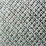
Screening and Dot Patterns
Just as photographers look at 100% or more view ports of their images, what makes the printed page rendering is all in the finest of the dot.
Our photo book review has two very different screening technologies.Blurb and SAAL and likely all others use AM (amplitude Modulation) by dividing image pixels or vectors into a grid patterned laser cell.
The dots or grids then have varying amounts of dots per block, yet the placement is always in a sms cell=dot.
Blurb’s screening was very good, clear, precise. SAAL was a little lesser, but the worst thing was control over light areas, where low density went from light to zero or random dots. That makes for harsh transitions into paper white, and some random noise in other areas.
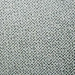
Whitewall is the unique one here. Few photo book reviews would analyse print technologies, yet here you see the avantages of FM (Frequency Modulation) inkjet printing. Drops make density by varying the frequency of dots (droplets) making for a diffuse pattern sometimes called stochastic.
Perhaps too technical, yet just to say the results are lovely, clear sharp text, beautiful transitions, very good contrast and light tone reproduction.

All images and layout for this photo book review were edited in ideal conditions. You can find my preferred equipment for colour management under Technologies review. For example my fabulous BenQ SW321C review