
X-Rite ColorChecker Passport review for fashion photography
Are you here looking for some good reasons for excellent efficient color corrections techniques for fashion photography? The X-Rite ColorChecker Passport review for fashion photography will tell you why!
Since its inception, I have been part of the development path as a background consultant for the X-Rite ColorChecker Passport and other devices for color management. X-Rite ColorChecker Passport review for fashion photography will give you real reasons to use it.

Last month the new X-Rite colorchecker video was announced, as well as the X-Rite colorchecker passport video of which a copy is here in testing as I write. This is about the regular X-Rite ColorChecker Passport which can be used for photo and white balance for video.
This review will be quite short as almost everything you’d want to know is covered on the X-Rite web site . The construction is top notch, durable and practical. It opens two volets the first being the color checker 24 patch set standard to many applications, and the new custom personalisation chart where you can pick a white balance to warm or cool skin tones or landscape. Skin tones play in the subtle reds landscape plays into blues and greens. The other patches are for checking black clipping and uniformity of grey scale reproduction from raw or encoded images such as jpg, mpeg. The top row of saturated color is for visual checks against a known reference as well as a comparison tool against a calibrated monitor.
The other volet is simply a light grey large solid patch perfect for white balance. It is non reflective thus easy to set at less than perfect angles, and or with many spurious reflections by lights. All charts have a scale in mm although not sure what that is useful for.
The case is sealed for light protection but in no way is waterproof, or protected against harsh outdoors condition. Store the X-Rite ColorChecker Passport in a normal dry place away from light and it will be good for many years.
The advantage of this chart is the small portable size, around the size of an iPhone 5. Now, I am not going to say one should always take it with you for every shoot. For video, yes of course, or the new ColorChecker Video, but for photography, only a few types of speciality domains require very accurate color reproduction. Thesis also dependant on file format. For example, jpg is a file encoded from what the captor records, transformed with user preferences into a set color space. If you shoot weddings, and use jpg and raws the jpg will already have parameters set such as white balance encoded into the image. Once encoded it has already arranged all colours around this and cannot be undone. So, for jpg shooting and the best possible color settings to work well a minimum of white balance is required via custom white balance of a shot of the color checker white balance chart (the light grey solid patch). If you are doing both raw and jpg, you can modify the white balance later with either the solid white patch or the two color patch volets. White balance is essential, the color patches is a bonus and makes for a lot easier work for post prod if you include it in a few of the set ups. The more difficult the set up such as with many different light sources and reflections the more you’ll want to use a chart.
Product photography, fashion, or any other photography that should render the colours in the scene as you thought you saw is aided by shooting the path sets.
Using it is extremely simple for such a sophisticated tool. Simply shoot it in the scene more or less flat to camera. Setting white balance in most cases is, choose white balance custom, shoot a frame of the grey patch filling the frame, and selecting that as the white balance. With raw it is only an indication, for jpg it is used to correlate all colours to the output color space.
The real joy is the simple yet fantastic plug in that is installed into LightRoom for automatic DNG profile camera calibration profiles. You simply open or import any raw image into LR, click on export under the X-Rite presets ( installed with the X-Rite ColorChecker Passport application), and the plugging in asks you to name the profile, and find the chart regardless of rotation, build the profile, then tell you to restart Lightroom. Nothing could be simpler. The color calibration profile then is available to Bridge, Adobe CameraRaw, and Lightroom of course.
Now that the profile is built, where is it useful and how is it applied?
This is the most important aspect of the color checker and camera calibration. IF you shoot the chart in controlled lighting be it daylight, studio, portable strobe whatever, you can lock the calibration down to a default preset for all images forthwith in Lightroom by applying this calibration, along with any other settings to each camera serial number. Various cameras have varying colours which can be equalised or characterised by doing so. Not happy with your default colours in Lightroom or Photoshop? It could be fixed easily and quickly for not only this camera but all your cameras. I have always found the default calibrations to be a bit weak and some reds problematic with Canon in Adobe apps. By simple calibration this was easily fixed, and if set to default it was easier to have bright colours as seen while shooting, rather than relying on defaults.
[one_half]

Color Checker Passport export plug in Lightroom
[/one_half]
[one_half]

Color Checker Passport successful profile export from Lightroom
[/one_half]
If outside of Lightroom it is still easy with the ColorChecker Passport application. More or less the same procedure except you have to first export as DNG, and a little beyond with the ability to create a hybrid dual illuminant profile. I find it is useful but not as important as a one light standard set up where you’ll want to tune the colour off the sensor for all images.
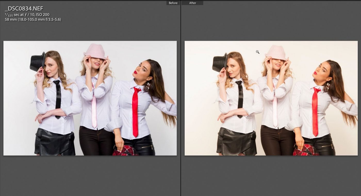
Sad to say , Phase One Capture One does not have any ability to use other than ICC profiles, nor can it create calibrations like Lightroom. I find the default C1 profiles to be far from acceptable in certain colours, like reds in hair some oranges etc. for Canon raw files. While editing 400 images for a client’s fashion shoot I quickly realised the great advantage of Lightroom and the X-Rite Color Checker Passport which I had them shoot into a few frames in my studio lighting. The defaults for the Nikon D90 are poor in both C1 and LR, far from what was really there. Impossible to hand correct or do it by eye, a CC Passport is the absolute required tool. Once the calibration profile was created, after restarting LR, and applying the new calibration to all images was an easy task. Next set the white point on the chart grey patch. After I tweak the values of some colours until the chart is closer to what I see on my calibrated BenQ 27″ PT monitor, and very quickly all 400 images are sellable images destined for web marketing with the assurance of colour correction fro shoot to export all done with a couple of easy clicks.


Conclusion: Photographers who are making sellable colour accurate pictures won’t want to do without.
Pros: small size, included software, visual reference material.
Cons: needs a little tweaking for a tad over saturated colours, lack of C1 integration, no absolute black hood.